Teaching Wellness: Crafting Vibrant Brand Graphics for a Self-Care Course for Teachers
Empowering Educators to Prioritize Self-Care and Wellbeing Through Engaging Visuals
Work with MeProject Info
A client approached me with a unique project. They needed a logo and landing page (plus other assets) designed for a self-care course they were creating, specifically tailored for teachers like herself. For context, they explained that teachers need self-care because of the high level of stress and demands associated with their profession.
Teachers spend a lot of time and energy meeting the needs of their students, often putting their own needs and well-being on the backburner. This can lead to burnout, fatigue, and emotional exhaustion, making it difficult for teachers to perform their job effectively. Engaging in self-care practices can help teachers reduce stress, improve their mental and emotional well-being, and increase their ability to effectively support their students. By prioritizing self-care, teachers can improve their overall job satisfaction and quality of life, which can ultimately benefit both themselves and their students.
The client had some ideas in mind for the design, but gave me creative freedom to come up with something that perfectly represented their brand. After several brainstorming sessions, I had a flash of inspiration. The sample inspiration images the client provided were also helpful in guiding the direction of the design.
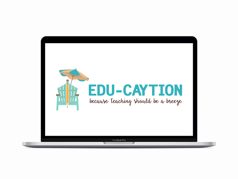
For the logo, I decided to take a minimalist approach. I took out a trusty pencil and sketched out a simple image of a lawn chair on a sunny day, symbolizing the relaxation and restfulness that the self-care course would provide for teachers. The logo was completed with the client's course name written in bold, elegant typography, with shades of blue and light colors to make it look as relaxing as a breeze on a sunny day at the beach.
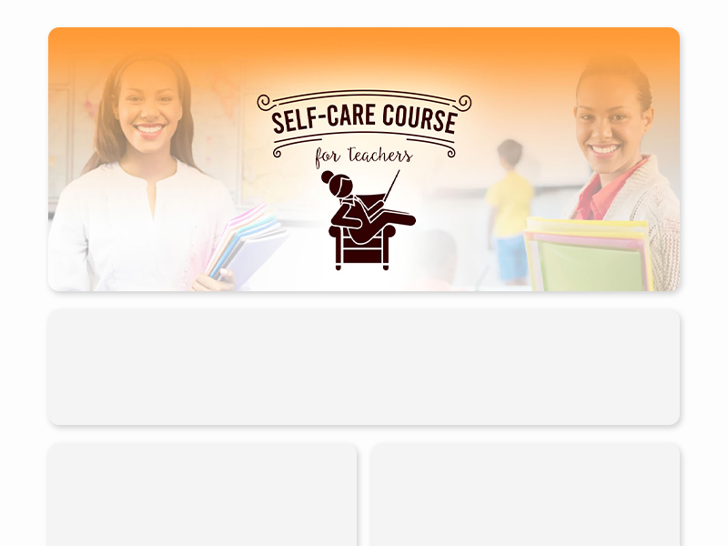
Next, I set to work on designing the landing page. I knew that the banner image would be the centerpiece of the page, so I focused on creating an image that would grab the viewer's attention and convey the course's message. The banner featured pictures of teachers who got their self care in check.
I decided to use a stick figure of a teacher reclining in a comfortable chair, a look of peace and contentment resembled on their pose. The figure was colored light brown only to keep it simple.
After several rounds of revisions and tweaks, the final designs were complete, and the client was ecstatic. They were impressed by how well the designs captured the essence of their self-care course.

The client's self-care course was a huge success, and the logo and landing page designs played a significant role in attracting new participants. And every time the client saw the logo and landing page, they were reminded of the joy and relaxation that their self-care course brought to so many teachers.
I cannot recommend Gwen enough! She designed the logo and landing page for my self-care course for teachers, and the results were beyond my expectations. The logo perfectly captured the essence of our brand. Thanks to Gwen's hard work and creativity, our self-care course has been a huge success, attracting many new participants. The designs they created were integral to this success, and I have no doubt that they will continue to play a significant role in the growth of our course. I highly recommend Gwen for any design needs you may have. They are professional, responsive, and incredibly talented.

CJ Charles
Course Founder
Project information
- Category Logo Design
- Client CJ Charles
- Project date May 2021


